
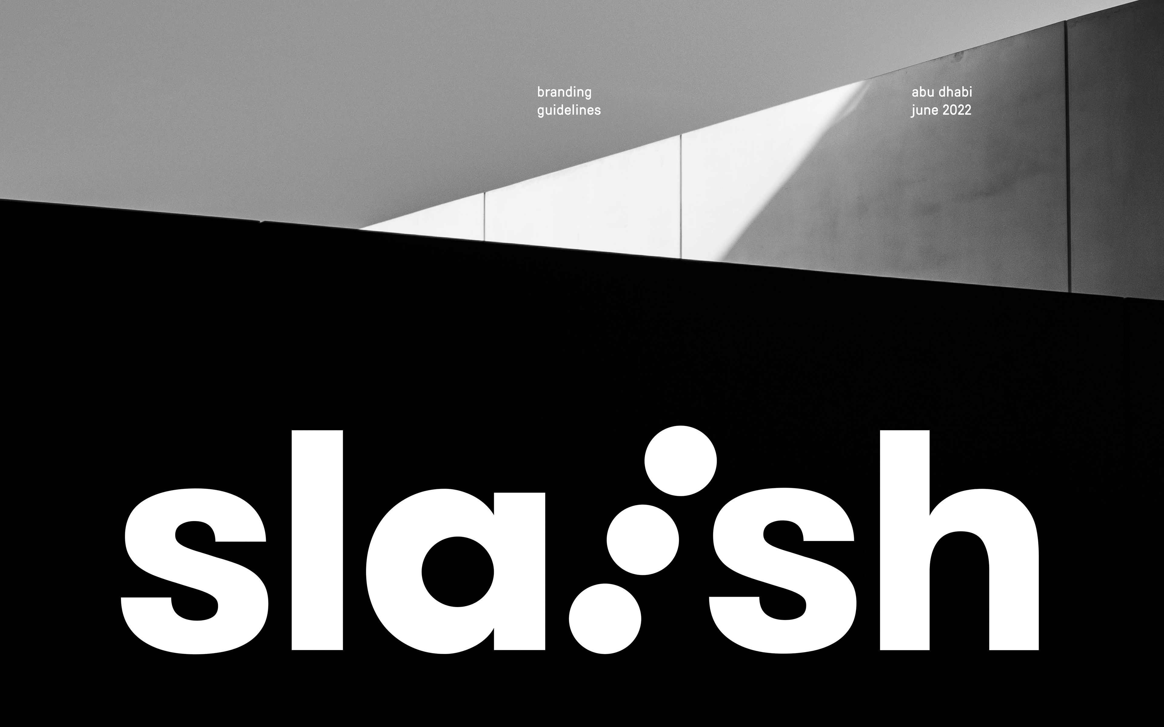
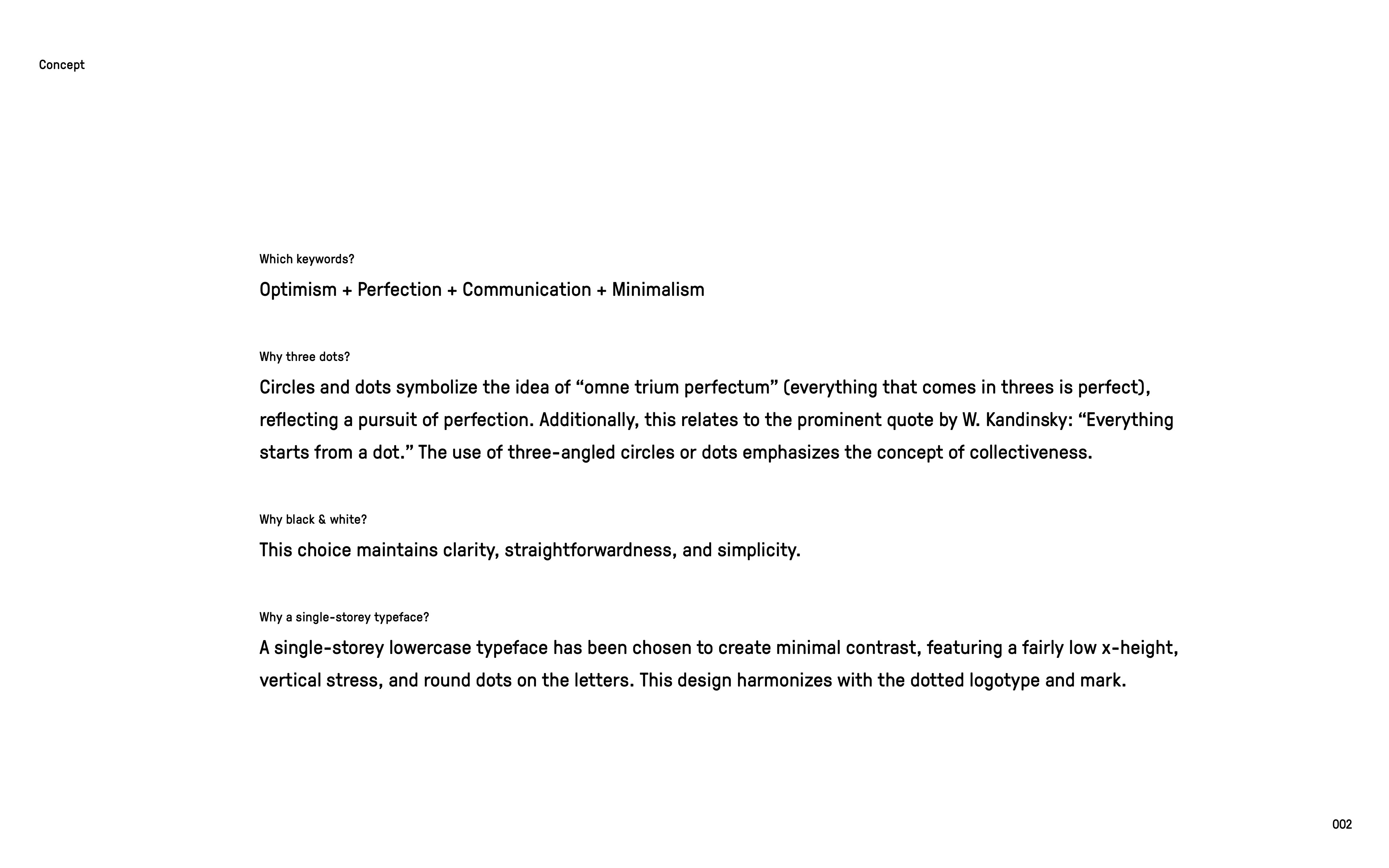
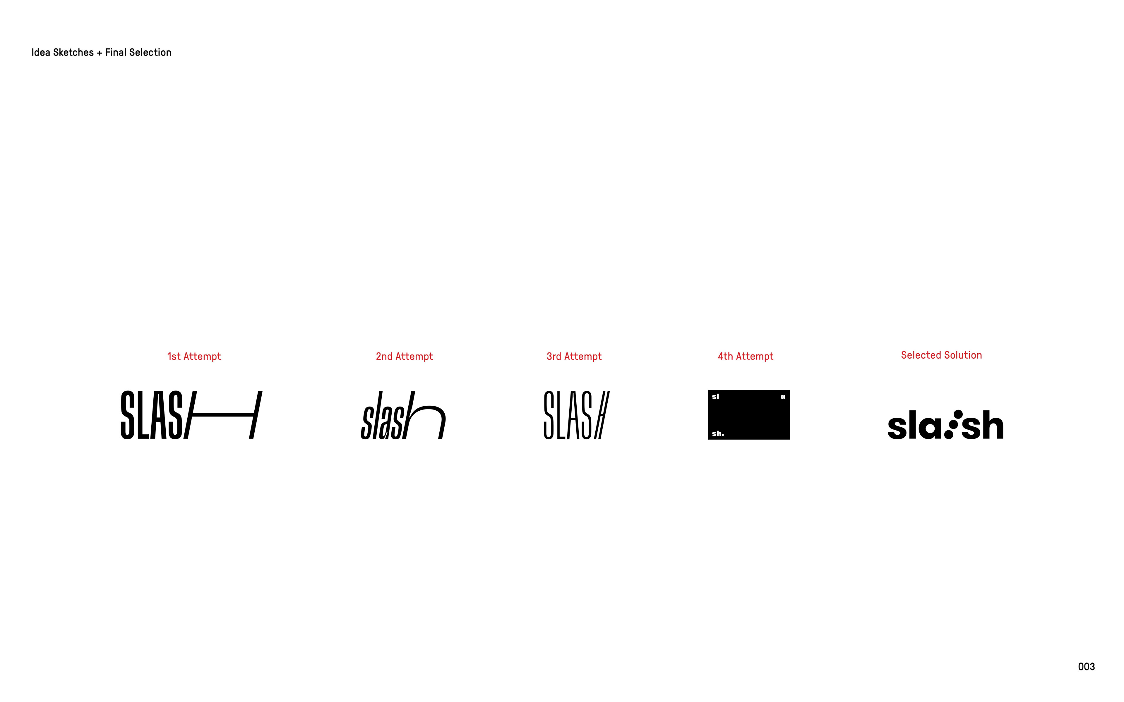
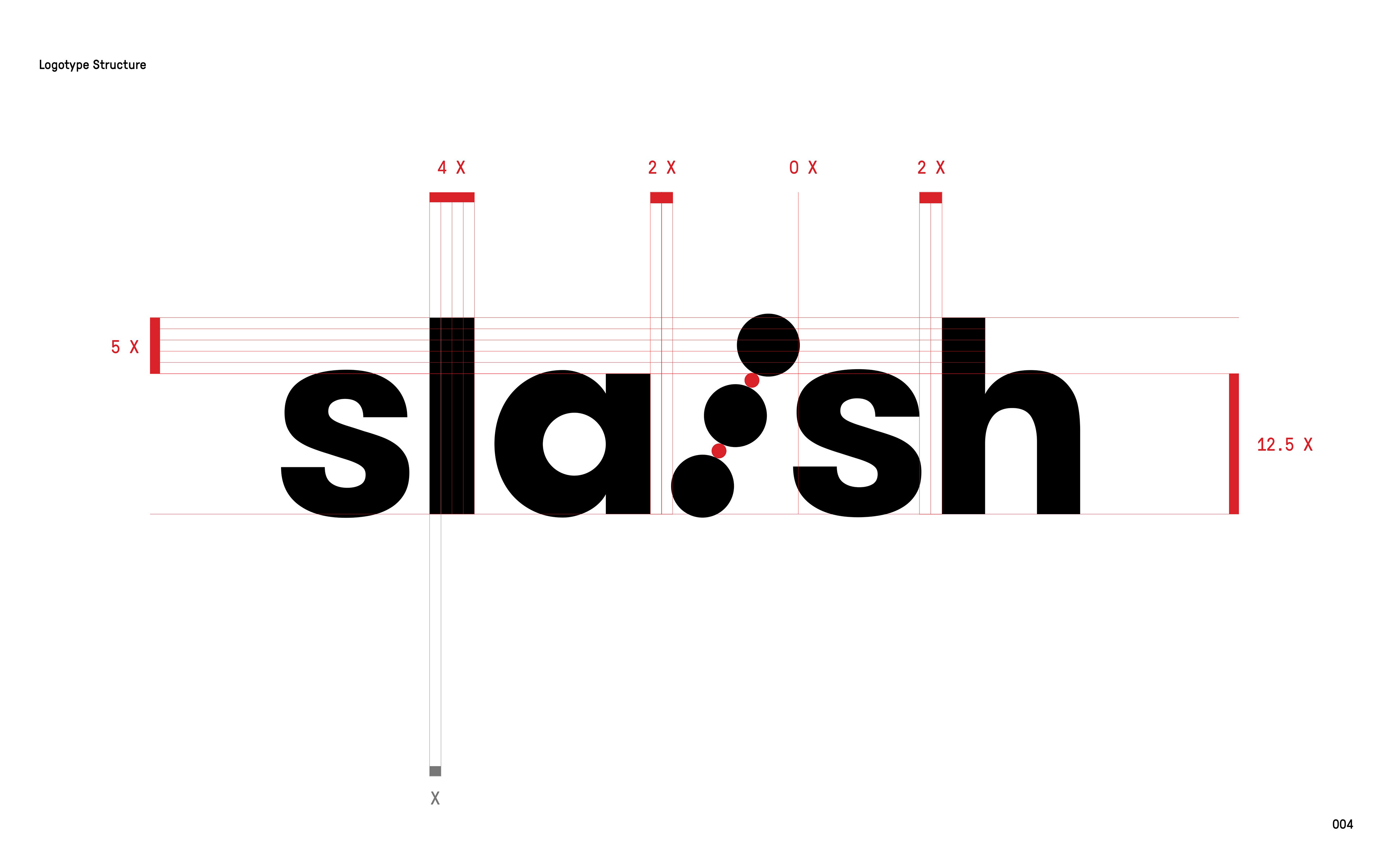
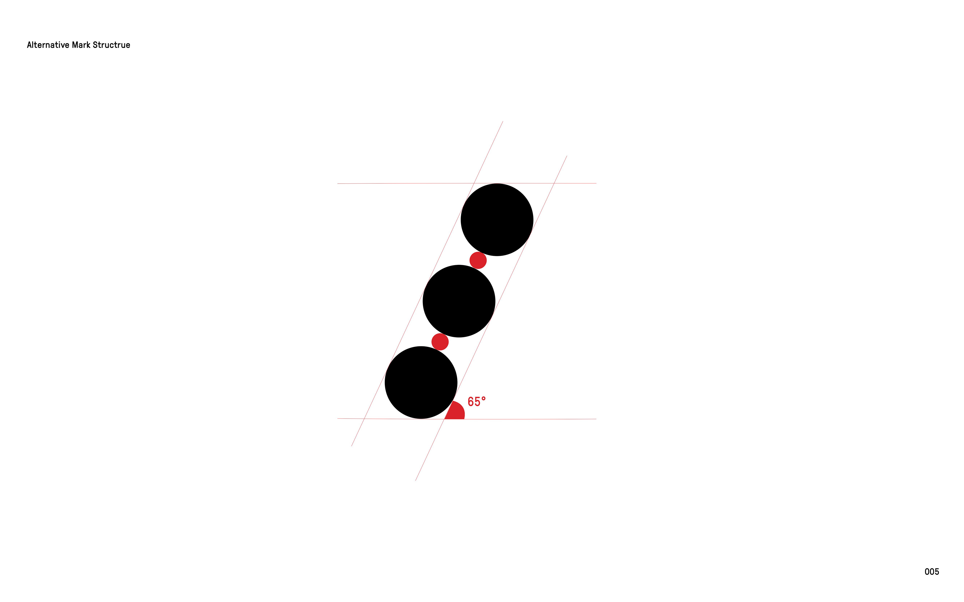
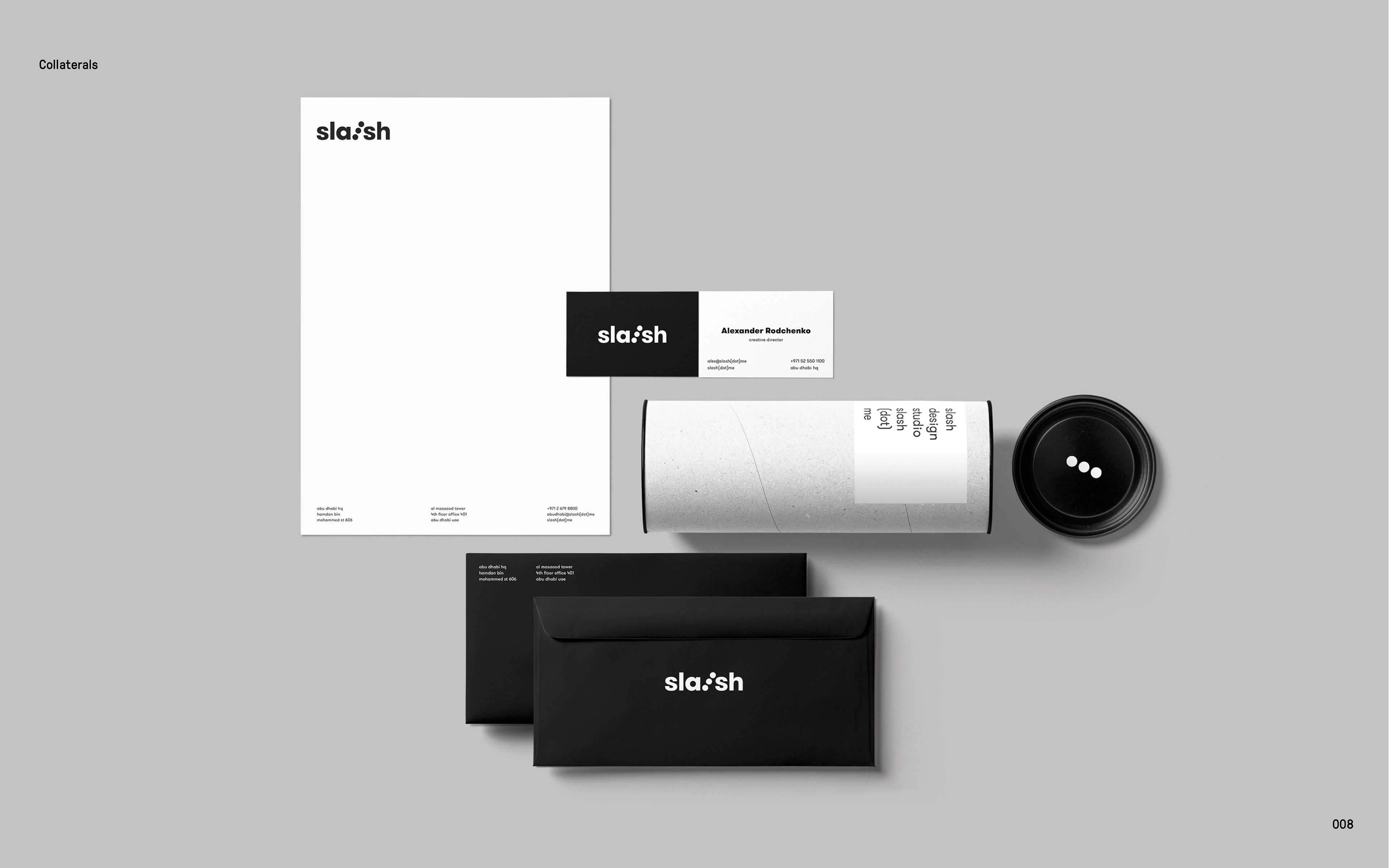
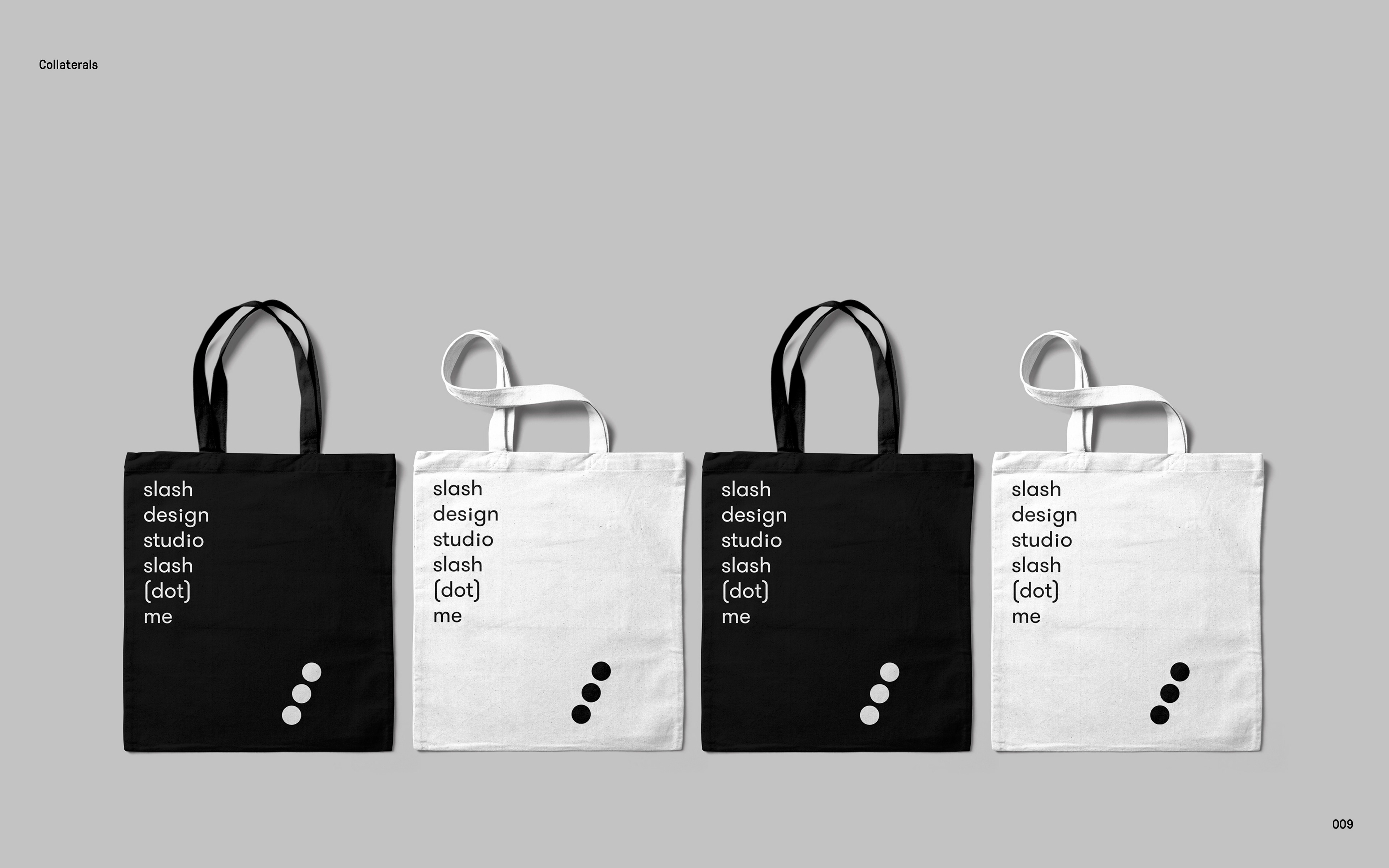
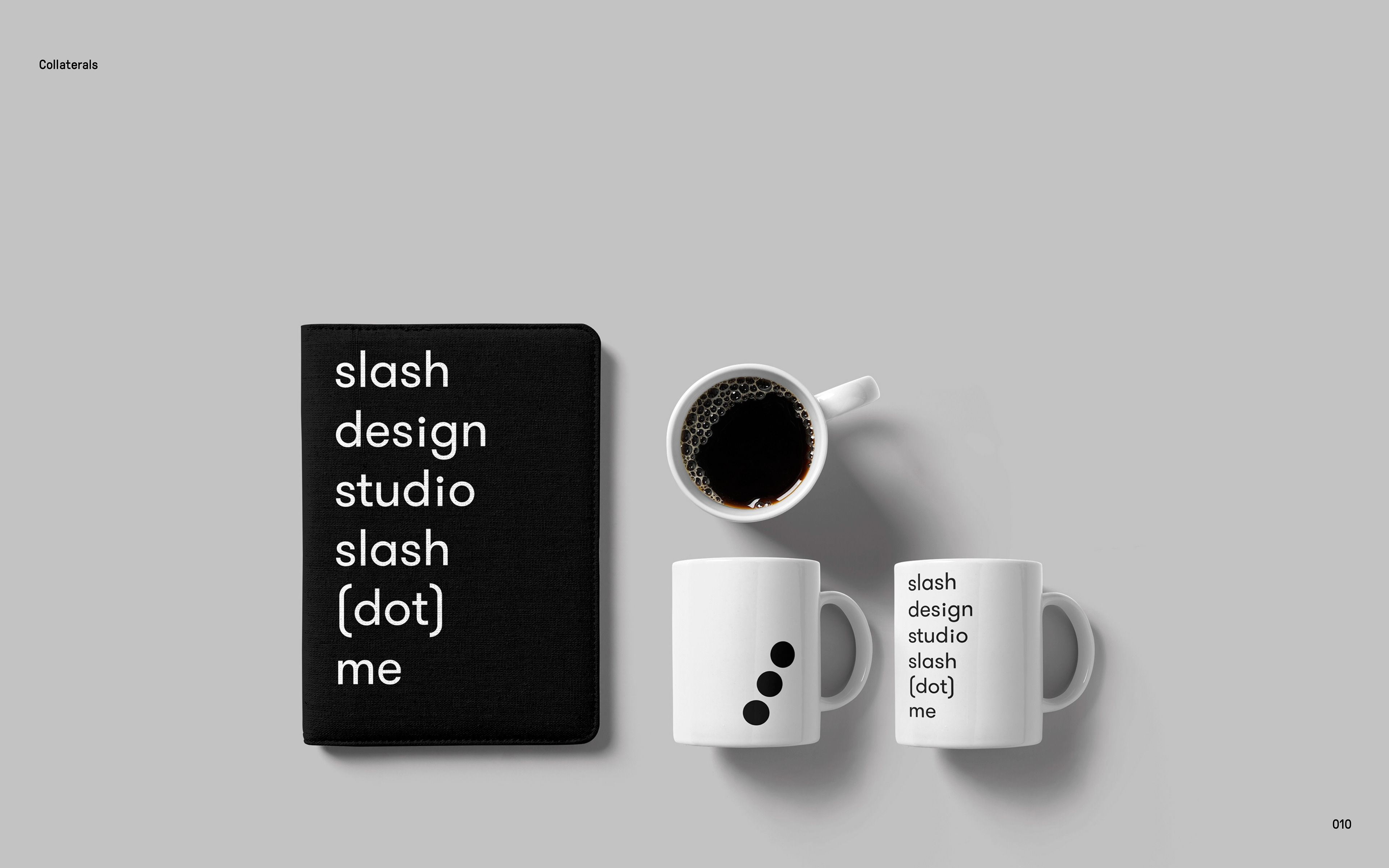
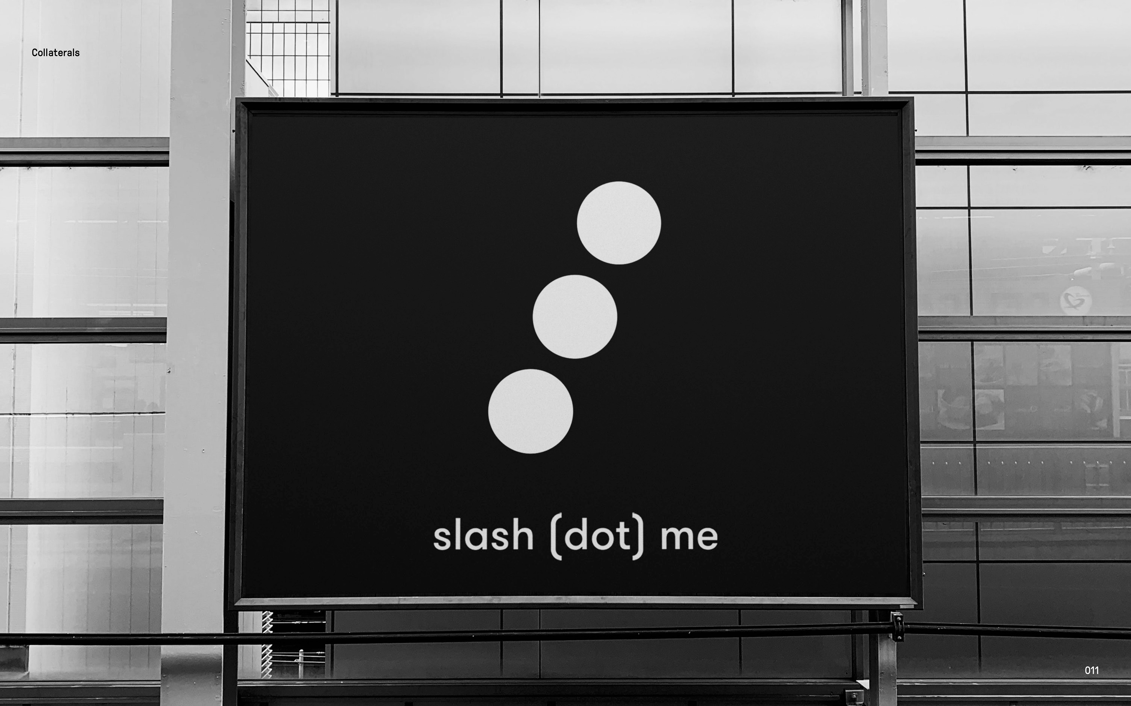
This rebranding concept is built on a simple yet foundational idea: everything begins with a dot. Inspired by Kandinsky and the principle of omne trium perfectum, the identity translates optimism, perfection, communication, and minimalism into a clear visual system. The three dots form the core of the mark, symbolizing harmony, continuity, and collective creation.
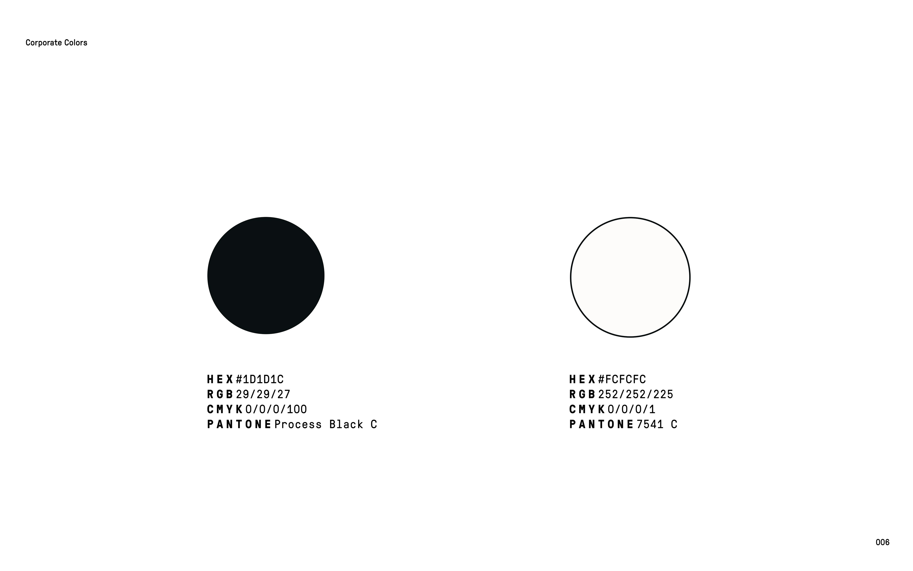
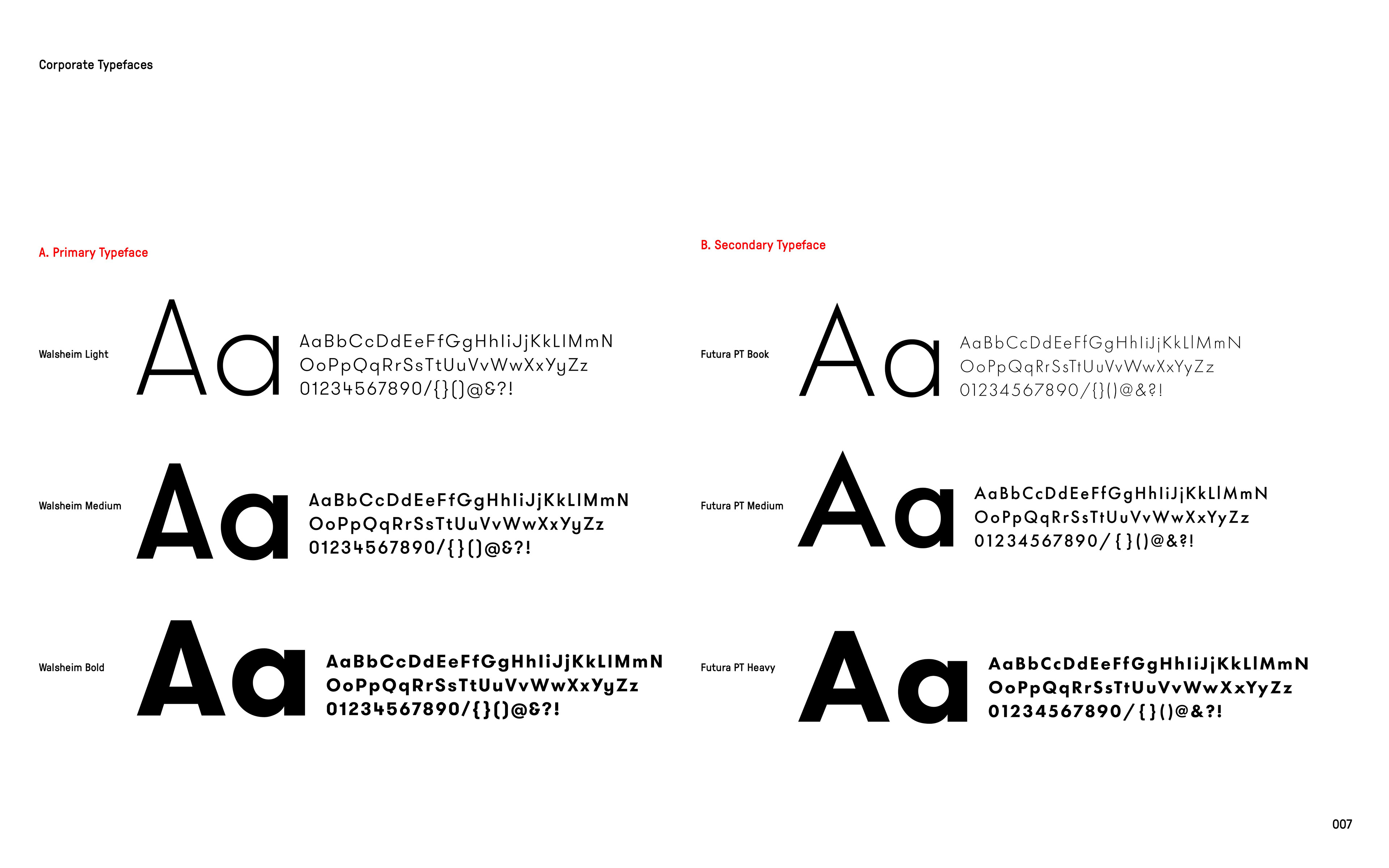
A black and white palette maintains absolute clarity, allowing geometry, spacing, and rhythm to speak without distraction. The single-storey lowercase typeface reinforces softness and accessibility, while its rounded details echo the dot motif to create a unified typographic texture.
The system integrates naturally with the studio’s overall design philosophy and resonates with the inherent logic of the slash symbol, mirroring its directionality and structural precision. The project embraces reduction as a strength, offering a timeless, coherent, and concept-driven identity built on elemental forms.
© Gökhan Numanoğlu, Abu Dhabi, 2022