
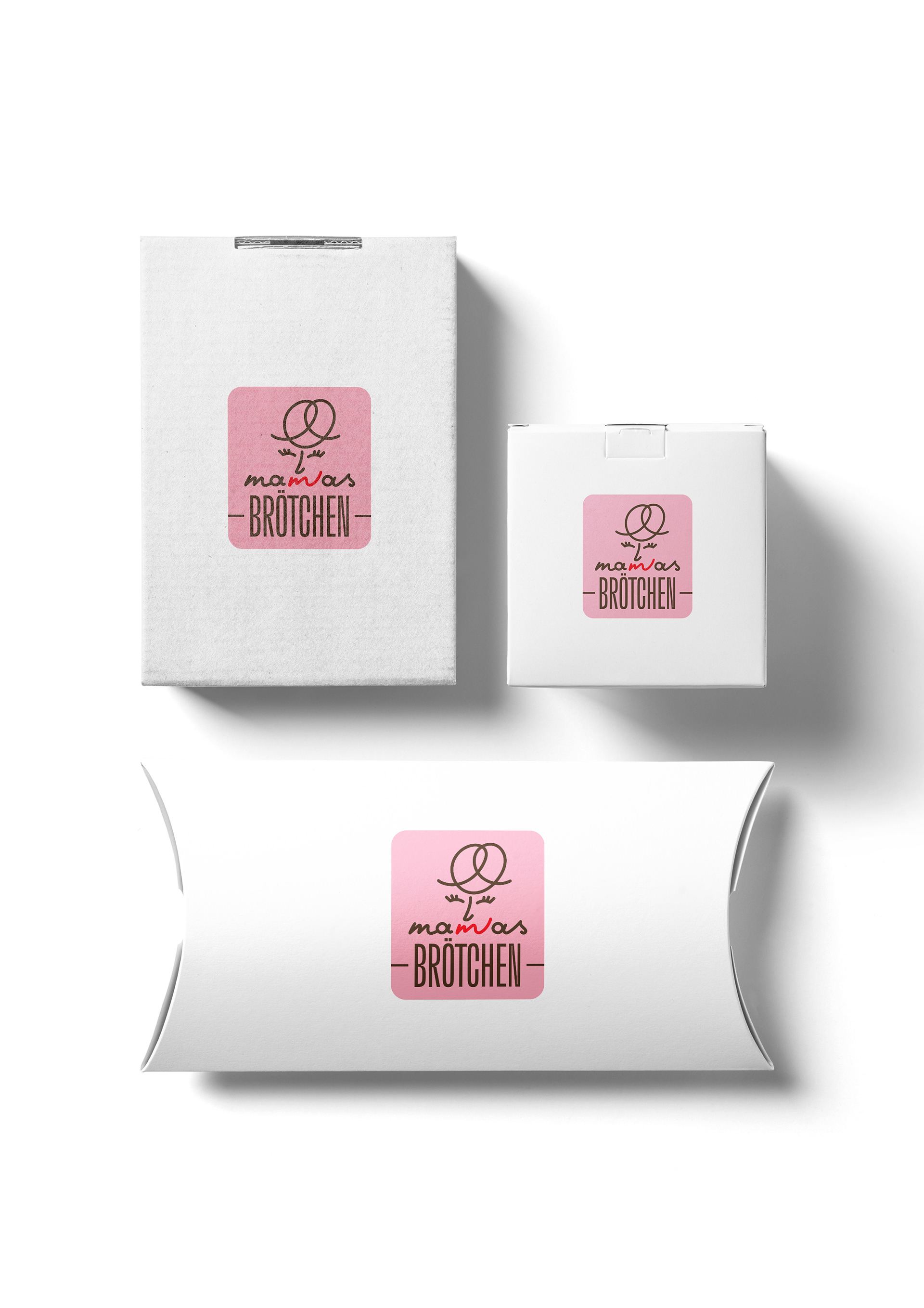
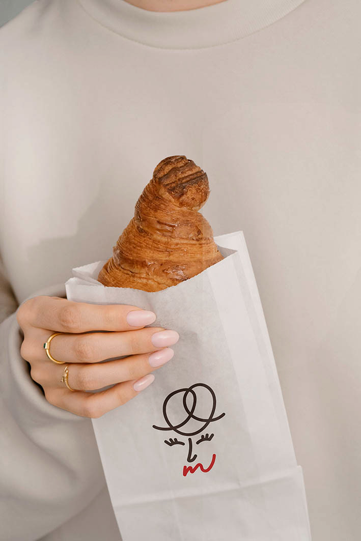
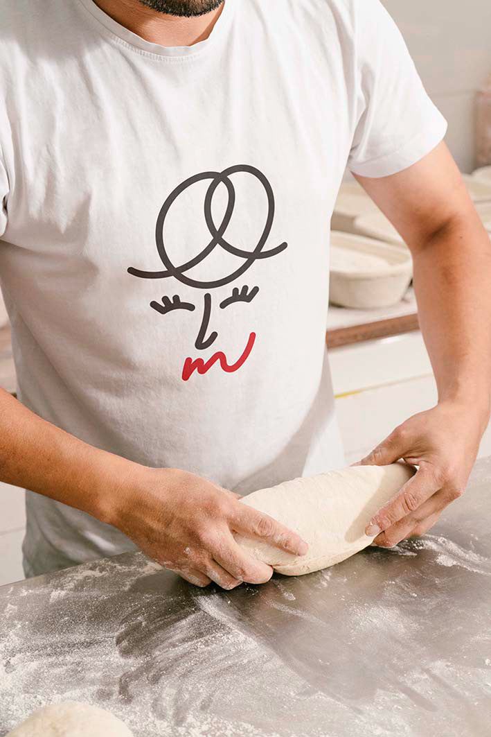
Developed for a Munich-based family initiative, this brand identity takes inspiration from the Bavarian “Brezel.” The logo features a smiling woman whose hair forms a pretzel shape, seamlessly her lips turning into the letter “m.” The name "Mamas Brötchen" evokes warmth and home-baked sincerity; “a mother’s touch” in every bite. A cursive custom lettering paired with a condensed sans-serif font reflects the balance between handcrafted tradition and modern urban life, creating a friendly and trustworthy visual narrative rooted in Bavaria’s pastry and baking culture.
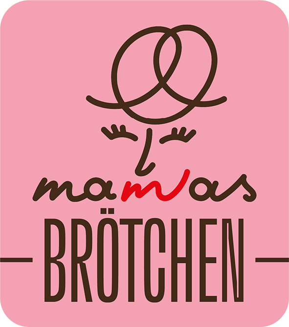
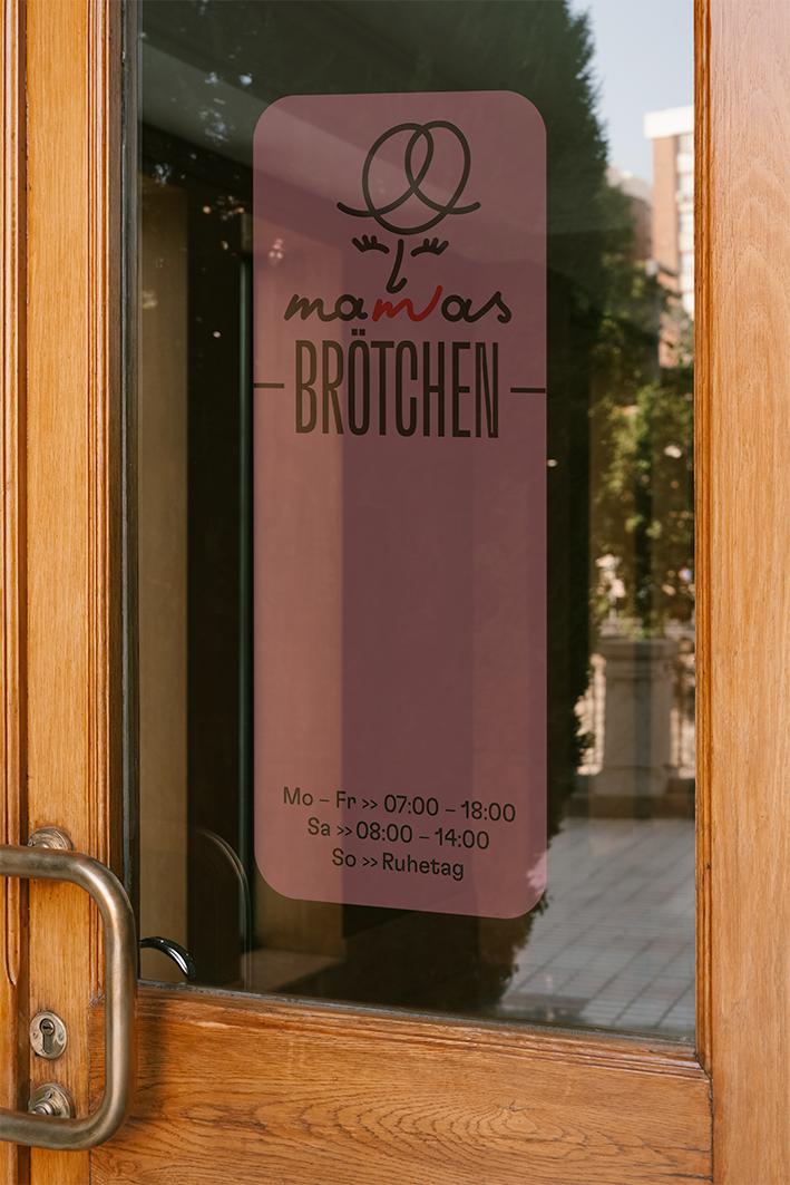
© Gökhan Numanoğlu, Logo design & branding, Munich, 2023